Definition and Usage
The -webkit-text-stroke property
styles the stroke of text characters.
Explore its syntax, usage, and key considerations with practical examples.
- This is a shorthand property that defines the
-webkit-text-stroke-widthproperty, which specifies the thickness of the stroke around text characters, - and the
-webkit-text-stroke-colorproperty, which specifies the color of the stroke around text characters, - within a single declaration.
Basic Example
TEXT STROKE
Formal Syntax
selector {
    -webkit-text-stroke: <'-webkit-text-stroke-width'> || <'-webkit-text-stroke-color'>;
    /*
        These values correspond to the values of the
        -webkit-text-stroke-width and
        -webkit-text-stroke-color properties.
        The order of these property values does not matter.
        If a property value is omitted, its initial value is used.
    */
}
Syntax
/* width | color */
-webkit-text-stroke: 3px magenta;
-webkit-text-stroke: thin magenta;
-webkit-text-stroke: medium magenta;
-webkit-text-stroke: thick magenta;

/* color | width */
-webkit-text-stroke: magenta 3px;
-webkit-text-stroke: rgba(0, 0, 0, 0.6) 3px;

/* width: % values are not allowed */
-webkit-text-stroke: 5% magenta;

/* Global values */
-webkit-text-stroke: inherit;
-webkit-text-stroke: initial;
-webkit-text-stroke: revert;
-webkit-text-stroke: revert-layer;
-webkit-text-stroke: unset;
Formal Definition
| Initial value | For each shorthand property:
-webkit-text-stroke-width: 0
-webkit-text-stroke-color: currentcolor (the current text color) |
|---|---|
| Applies to | all elements |
| Inherited | yes |
| Animatable | Supported for -webkit-text-stroke-color only |
Things to Keep in Mind
- Animation is supported only for the
-webkit-text-stroke-colorvalue; it cannot be applied to the-webkit-text-stroke-widthvalue. - Percentage (
%) units are not supported for the-webkit-text-stroke-widthvalue. - Visual artifacts, such as overlapping paths, may occur when using variable fonts.
Overlapping Paths in Variable Fonts
Static fonts (traditional fonts) provide separate font files for each style, such as weight (e.g., Thin, Light, Regular, Bold), width, or slant. Unlike static fonts, which require separate files for each style variation, variable fonts integrate all styles into a single font file.
When -webkit-text-stroke is applied to variable fonts, the strokes (outlines) of text characters may overlap, resulting in a visual artifact known as overlapping paths.
Variable fonts construct a single character by overlapping multiple shape components to allow for flexible adjustments of weight and width. Because the -webkit-text-stroke property specifies a stroke for every individual component, strokes are also rendered where these shapes overlap within the character. This results in unintended internal lines where the components intersect.
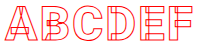
The "Roboto" typeface, available through Google Fonts, is a well-known example of a variable font.
Below is a live demo showing -webkit-text-stroke applied to the "Roboto" typeface.
<style>
    @import url('https://fonts.googleapis.com/css2?family=Roboto+Mono:ital,wght@0,100..700;1,100..700&family=Roboto:ital,wght@0,900;1,900&display=swap');
    .text {
        font-family: "Roboto", sans-serif;
        font-size: 47px;
        font-weight: 900;
        -webkit-text-fill-color: transparent;
        -webkit-text-stroke: 1px red;
    }
</style>
<p class="text">ABCDEF</p>ABCDEF
It would be ideal if this overlapping path issue did not occur, but unless the browser’s rendering behavior changes, it is difficult to resolve it automatically.
Practical Examples
The following examples demonstrate various ways to style text characters using the -webkit-text-stroke property.
Creating Stroke-Only Text Characters
<style>
    .text {
        font-size: 47px;
        font-weight: 900;
        -webkit-text-fill-color: transparent;
        -webkit-text-stroke: 1px red;
    }
</style>
<p class="text">TEXT STROKE</p>TEXT STROKE
The -webkit-text-fill-color property used in the example above specifies the fill color for text characters. This property overrides the standard color property, which typically defines the text color.
Adding box-shadow to Stroke-Only Text Characters
<style>
    .text {
        font-size: 47px;
        font-weight: 900;
        color: #fff;
        -webkit-text-stroke: 1px red;
        text-shadow: 1px 4px red;
    }
</style>
<p class="text">TEXT STROKE</p>TEXT STROKE
Text Characters with Gradient Strokes
<style>
    .text {
        font-size: 47px;
        font-weight: 900;
        color: #fff;
        -webkit-text-stroke: 5px transparent;
        -webkit-background-clip: text;
        background-clip: text;
        background-image: linear-gradient(to bottom, red, blue);
    }
</style>
<p class="text">TEXT STROKE</p>TEXT STROKE
Browser Compatibility
| Property |
Desktop Chrome

|
Desktop Edge

|
Desktop Firefox

|
Safari

|
|---|---|---|---|---|
-webkit-text-stroke
|
4 | 5 | 49 | 3 |
Specifications
| Specification | |
|---|---|
-webkit-text-stroke
|
Compatibility Standard #the-webkit-text-stroke |
See Also
- CSS -webkit-text-stroke-width Property – Specifies the Stroke Width of Text
- CSS -webkit-text-stroke-color Property – Specifies the Stroke Color of Text
- CSS text-shadow Property – Applying Shadow Effects to Text
- CSS text-decoration Property – Shorthand for Text Decoration Styling
- CSS text-emphasis Property – Shorthand for Emphasis Marks