Definition and Usage
The background-clip property specifies how far an element's background (color or image) extends, determining the area that will be clipped.
You can choose one of the property's values—border-box, padding-box, content-box, or text—to specify the area in which the background will extend (i.e., be clipped).
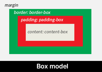
The terminology for the possible values of the background-clip property is described below:
border-box: Refers to the area that extends to the outer edge of theborder.padding-box: Refers to the area that extends to the outer edge of thepadding.content-box: Refers to the region where the actual content of the element resides, such as text, images, or videos. This is the inner area up to the content edge, and if the element haspadding, it lies inside thepaddingregion.text: Refers to the area that matches the shape of the text foreground itself.
Basic Example
<div>codingCourses</div>div {
font-size: 2em;
font-weight: 900;
text-align: center;
border: 10px dashed red; /* The area up to the outer edge of the border
corresponds to border-box */
padding: 30px; /* The area up to the outer edge of the padding corresponds to padding-box
The inner area inside the padding corresponds to content-box */
background-image: url("flower.jpg");
background-position: center;
background-clip: border-box; /* initial value */
}Note:
The background of an element (color or image) is always painted behind the border.
The root element, <html>, does not have any effect when the background-clip property is applied.
Formal Syntax
background-clip: border-box | padding-box | content-box | textValues
border-box |
Initial value.
The element's background extends up to the border-box (i.e., it is clipped at the border). |
|---|---|
padding-box |
The element's background extends up to the padding-box (i.e., it is clipped at the padding) |
content-box |
The element's background extends up to the content-box (i.e., it is clipped at the content area). |
text |
Refers to the area matching the shape of the text foreground itself. |
These values can be observed through the element's box model.

The CSS box model is a fundamental concept that defines the structure and layout of elements on a web page. Each HTML element consists of content, padding, border, and margin. These components form a box around the element, which is referred to as the "box model."
Syntax
/* Keyword values */
background-clip: border-box;
background-clip: padding-box;
background-clip: content-box;
background-clip: text;

/* Global values */
background-clip: inherit;
background-clip: initial;
background-clip: revert;
background-clip: revert-layer;
background-clip: unset;
Formal Definition
| Initial value | border-box |
|---|---|
| Applies to | all elements. |
| Inherited | no |
Using background-clip: text
Among the possible values of the background-clip property, text was originally proposed as part of CSS3. However, in the CSS Backgrounds Module Level 4, it is officially defined as a valid value of background-clip.
When using background-clip: text, for browser compatibility, WebKit-based browsers previously required the vendor-prefixed property -webkit-background-clip. However, starting from 2024, most browsers support background-clip with the text value without the -webkit- prefix. See Browser compatibility for details.
/*
    Prior to 2024, WebKit-based browsers did not support
    background-clip: text. You had to include the vendor prefix '-webkit-'.
*/
-webkit-background-clip: text;

/*
    Starting in 2024, most browsers support the 'text' value
    without the '-webkit-' prefix.
*/
background-clip: text;
Using with color: transparent
The background-clip: text value refers to the area that matches the shape of the text foreground itself. It does not refer to the text's background. If the text is fully or partially opaque, the visual effect will be minimal or invisible.
Therefore, to make background-clip: text visually effective, set color: transparent so that the text color (color) becomes transparent (transparent; see web color keyword names).
selector {
    background-clip: text;
    /* To make the text background visible,
       the text color must be transparent */
    color: transparent;
}
Example – Applying a Gradient Effect to Text
<div>TEXT</div>div {
font-size: 50px;
font-weight: 900;
background-clip: text;
color: transparent;
background-image: linear-gradient(red, blue);
}Browser Compatibility
| Property & Value |
Desktop Chrome

|
Desktop Edge

|
Desktop Firefox

|
Safari

|
|---|---|---|---|---|
background-clip
|
1 | 12 | 4 | 5 |
text
|
120 | 120 | 49 | 14 |
In Firefox, the text value does not work when background-attachment: fixed is set. See this bug report for details.
Specifications
| Specification | |
|---|---|
background-clip
|
CSS Backgrounds Module Level 4 #background-clip |